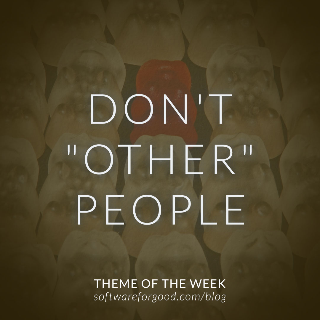
The idea of “othering” is used in social justice and cultural conversations to describe the action of labeling someone and singling them out as being different. People who don’t fit a dominant identity, whether race or gender or ability, are often excluded and made to feel like they’re outside the norm.
It wasn’t until I was watching a webinar about writing inclusive UX copy, led by Ada Powers as part of a series hosted by InVision, that I realized how easily othering can happen through web and mobile user experience. One piece of advice was to avoid using the word “other” when offering options for gender or race. Ada explained that when you make someone define themselves as “other” — for example, if they have a non-binary gender instead of either male or female — you’re literally othering them.
An alternative is to say “custom” instead of “other,” and then have an open-ended box, which is what Facebook does for gender. “Make edge cases feel like first-class cases,” Ada said.
I highly recommend checking out the full webinar for more insights about making language and UX inclusive and accessible. For me, it was a reminder of how quickly people can feel othered or excluded by a simple detail, and how easy it is to make sure they’re included instead.

