I never thought I’d get to this point. The point where I use the command line every day, and weeks go by without firing up any of the Adobe CC programs. When I made the move to Software for Good, I did so with the intention of making this kind of transition, but I don’t know if I really believed it would happen this quickly. I still do plenty of design work, but more by typing rather than clicking or drawing, and I’ve come to realize that the typeface I see the most and use the most now is actually the one I use in my text editor.
Good typefaces for coding all share a few key aspects (and more). One classic aspect is that typefaces designed for coding are monospaced. Monospaced means that each character takes up exactly the same amount of horizontal space. So, a lowercase m has to occupy the same width as a lowercase i. This provides perfectly vertically aligned glyphs and spacing, which is great for coding since alignment is helpful for scanning information and grouping things. Another key element is that certain characters need to be well distinguished from one another. The capital O can’t look like a 0, the lowercase l needs to be distinguished from a 1 and an I.

People who stare at code all day likely need the code optimized for readability at small sizes, so often the best coding typefaces will have larger x-heights. This allows lowercase letters to appear a bit larger than a more traditional typeface, which makes the characters easier to identify when small. There’s a bunch of other stuff, but that’s like a whole other post. I’m not going to give a list of nice typefaces for coding, either. You know how to Google things, plus, it can get subjective.
Some stuff just comes down to personal preference and what you become accustomed to, like a certain color scheme. I’ve literally spent hours choosing the colors that I want my HTML, CSS, Javascript and PHP to appear in my text editor. I love making color themes—again, another post. The reason a lot of programmers/coders do this is for quick identification of certain elements. You may be looking at thousands of lines of code, scrolling and scanning for a single comma that is breaking your code. So, if every comma is red that might be helpful. It might also be terribly distracting and difficult to read and probably not a great idea.
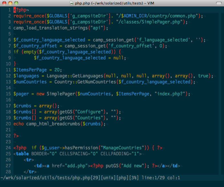 Color theme sample from http://ethanschoonover.com/solarized
Adding a bit of good typography practice can bump the readability of code. You can set the line height (or leading) in your text editor to give the words a bit more space around them. This gives your eye a bit more room to pick out a single line of text and focus on it. Some editors even let you configure certain combinations of characters to use a bold or italic version of the typeface. (More here on typography if you have time.)
All this color and typography stuff has been helpful for enhancing the coding experience so far, but what if there was MORE that could make it BETTER?
More, you say?
I’ve recently been dabbling in a bit of typeface design in my time outside of creative developing at work. All this close observation and wrangling of bezier points makes it hard not to pay attention to the typefaces I use when coding. After all, programming and markup languages are all still composed more or less of the same sets of characters, and I’m staring at type all day, though I’m not setting it.
It’s likely that your local typographer has read Beatrice Warde’s “The Crystal Goblet.” In this essay about typography, Ms. Warde (or B-dubs, as I know her) lays out some lovely prose about how type should act: it should be an invisible and unobtrusive presentation of wp-content. In other words, when you’re reading, you shouldn’t notice good typography at all, and the experience should be seamless. However, what if you need disruptions in text? What if you aren’t reading a novel but thousands of distinct lines that tell a computer do a thing? Reading code, in that context, means something closer to scanning and cherry-picking certain phrases, words, or individual characters, all while playing a game called “what’s missing here?” Instead of finely balanced characters that create a consistent block of text, you might need a tricked out, highlighted, half bold, half italic, crazy typeface that would make your local typographer weep openly.

Maybe for coding, we’re looking for something peppered with easily identifiable characters like versal letters on manuscripts back in the day (aka Medieval times). I see some cool ligature opportunities, like a double &&, or the chance to make oversized commas, braces and symbols. Could a text editor make use of OpenType features like contextual alternates and small caps? Perhaps a typeface design could indicate hierarchy in a sea of code without the use of color.
Maybe!
For the most part, typographic coding concerns (and seriously, who among us doesn’t have these?) are usually front end based. Making an <h1> look just right on a website, or spacing a menu in an app. My insight really doesn’t go any further than this here blog, but I’ve been kicking around the idea of designing an non-standard typeface for a while, so that’s something. I might even give it a try one day. All I’m saying is the next time you fire up your text editor, maybe you should think about this very blog post you just finished reading and have a real good look at the typeface BEHIND the typeface.
After you do that the one time, you don’t have to do it again unless you are super interested.