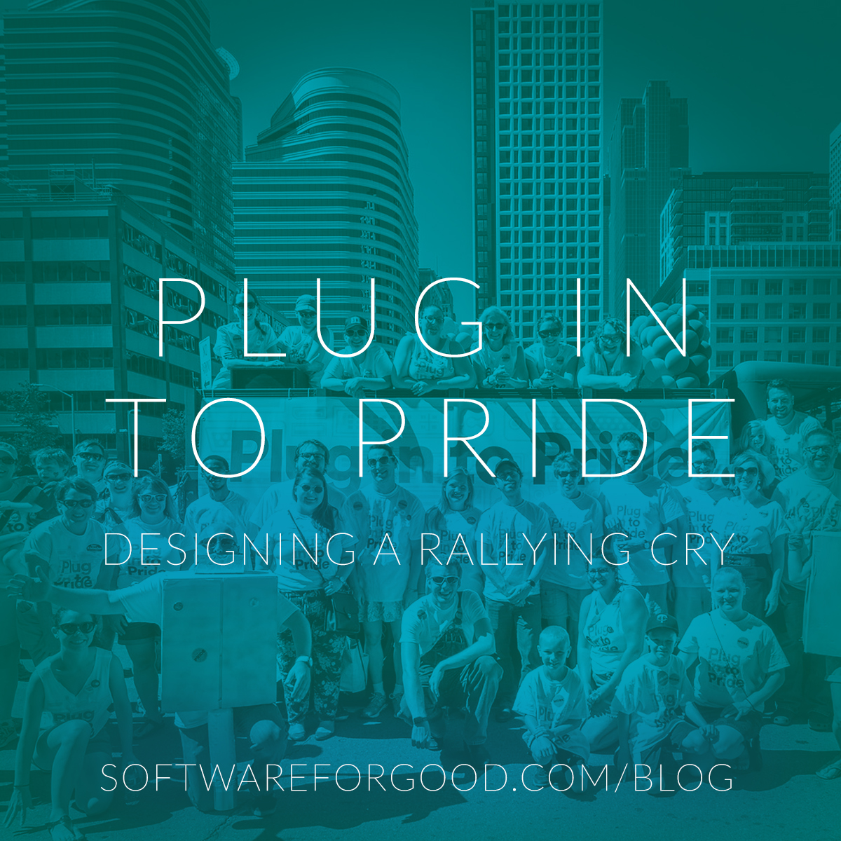
In case you missed it, Software for Good partnered with Clockwork and Buzzfeed this past Sunday to bring parade attendees at Twin Cities Pride a simple message: Plug in to Pride! With a cheeky double entendre and a message of diversity and inclusivity, we donned our shirts and revved up our decked-out, music-blasting M35 Cargo Truck to spread the good vibes. What the crowd saw was the final product, after plenty of meetings and iterations. Let’s take a look at how we landed on “Plug in to Pride,” and the concepts that fell off along the way.
Iteration 1: Designer without a Concept
Long before we landed on a group theme, the task to design a Pride t-shirt for Software for Good was felt daunting. I had no limits, but freedom can be paralyzing. With only the visual language of our organization as a jumping off point, I sketched some shirt designs around ideas like tech and computers and rainbows and pop art.
A single question guided my process: would I wear this shirt? Would I be happy to put it on after the parade, or would it be banished to the nether reaches of my dresser? In this way, I was totally satisfied with my first round of designs, although they fell apart under conceptual scrutiny.
They were what they were.

Shortly after I completed the first round of concepting, Software for Good met with our partners at Buzzfeed and Clockwork to discuss ways to bring all three organizations together around a central theme. I presented the ideas I had been working on and got some feedback that I totally agreed with – the shirts were nothing special. We needed a unifying element, a rallying cry, something to bring it all together. We all went back and forth on a number of different concepts, but we eventually landed on “Plug in to Pride.” I was ecstatic – finally, an idea! With a tagline and much-appreciated deadline, I went back to the sketchbook to figure out how to bring this concept to life.
Iteration 2: World of Plugs
I like to create constraints and systems to allow myself to work smarter. Most of my practice at Software for Good revolves around leveraging existing design patterns and systems to create new apps and websites at breakneck speed. Unfortunately, the same processes don’t play very well with more traditional graphic design projects: whether it’s a poster or a shirt or anything tactile, the only thing that really makes for a great result is time and experience. With a theme in hand, I was free to ideate and bounce ideas back and forth to really achieve something wonderful. In this case, the idea of ‘plugging into pride’ immediately struck me as something to leverage. What are we plugging in? It’s a cute and cheeky at the same time. And it’s active. My mind immediately went two ways: plugs and cables. Software development can be esoteric, but everyone’s plugged something in at some point. With this insight, I moved forward with the next round of revisions and presented them to the group at our next meeting, where I gathered a lot of valuable feedback.

I tend to gravitate toward simplified, geometric and iconic line work and bold typographic choices. This aesthetic seems to carry with it a kind of ‘love-hate’ attitude from clients. Some thought this version looked too retro, which I gladly conceded while simultaneously hiding my new Draplin Design Co. book. Others thought that it kinda looked like Minnesota, but not enough like Minnesota to really work as a concept. The most interesting piece of feedback, though, wasn’t about the aesthetics of the illustration, but the mechanics of the cable. “It’s hetero,” someone said. And that’s totally true. I didn’t even realize it. You’ve got a male and a female end of the cable right there in plain sight. So how do we solve that? The last thing I wanted was to broadcast a heteronormative viewpoint at Pride Festival, (check out my first blog post if you want some good soap box action) so I took the concept back to the drawing board.
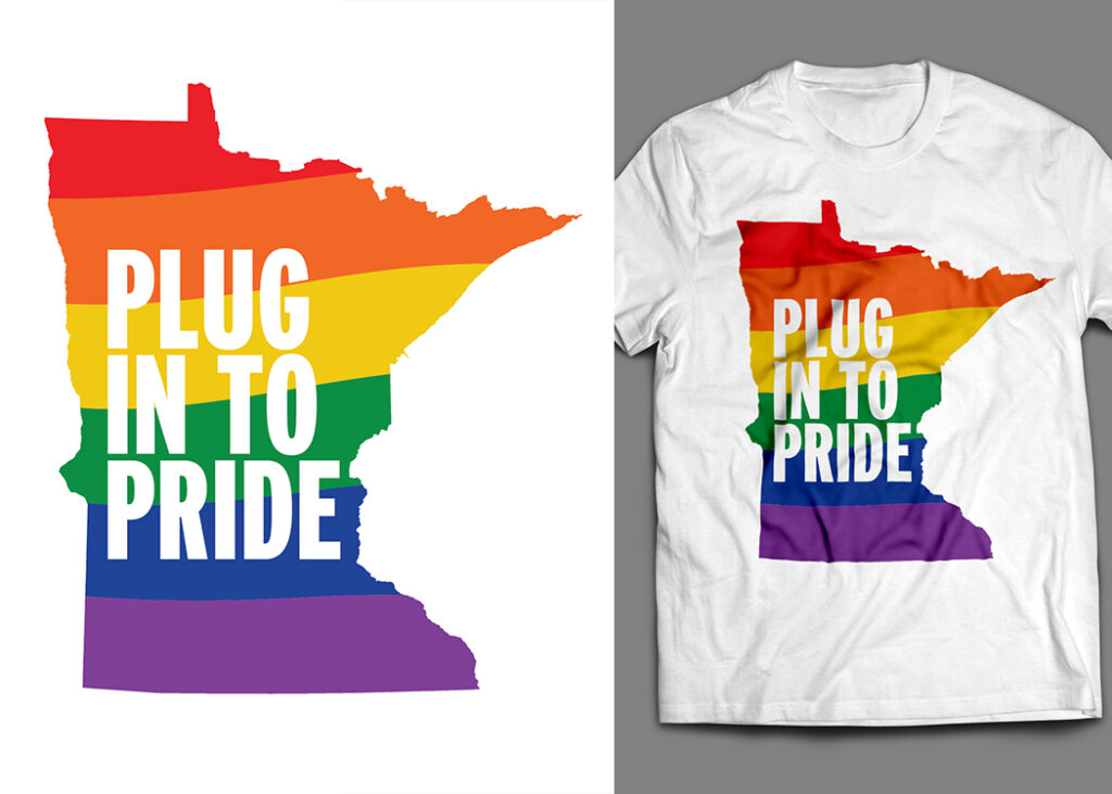
This concept was probably the safest and least exciting one to work on (everyone else agreed, too), but it served an important purpose in relation to the final design. I knew I wanted to do something with the Minnesota motif. If Minnesotans in big gatherings love anything, it’s Minnesota. Using it as a framing device for the flag, coupled with some bold typography, helped ground further revisions into what became the final design. Still, some thought this design had some merit. “What about rainbow cables?” they said. What about them…

For this concept, I created a pattern system consisting of custom-illustrated male and female ports that I thought would be recognizable to anyone who’s spent any amount of time near a computer. HDMI ports, USB ports, power ports, DVI ports, DisplayPorts. The tech is used conceptually as a tongue-in-cheek reminder of how we plug in on a daily basis, while the diversity of the types of plugs is a nod to inclusivity and diversity. Structurally, this concept was my favorite. Good design functions both at a distance and up-close. With this design, the viewer receives the message from a distance, and the joke up-close. However, the pattern didn’t seem very active. I knew it was on the right track, but not quite there.
Iteration 3: Figuring it Out
After receiving an additional round of feedback on the concepts I presented, I tried to flesh out each one into something we could choose for a final. I put equal time into each one, trying to come back to the table with three solid revised concepts that could be sold equally. Nothing’s worse than a client picking your least favorite idea, so only present work you’re proud of!
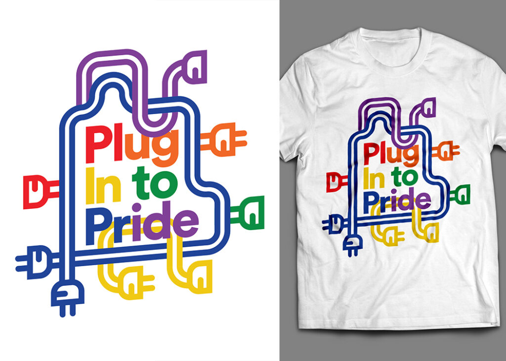
Maybe I got a little carried away with the revision of this concept. I got rid of the hetero plug and replaced it with plugs of all kinds. Inclusive plugs! Male to male, male to female, female to female. I also lifted the rainbow type from the other concept to reduce the amount of visual clutter a little. Still, this concept started to feel a little busy. I like the way the plugs interact with one another and the type, but it wasn’t my favorite. After all that work, this one was passed over.

I still really love this concept. I took the idea of rainbow cables and ran with it, creating an outline of Minnesota that had no beginning and end, with plenty of cute little corners and swirls. I really enjoy how the outline interacts with the type, but when I brought this design back to the table, it suddenly didn’t read quite enough like cables. “We need a plug on it,” someone said. If we did that, we’d be right back where we started with the hetero plugs from before. Sometimes design can feel like a circular exercise.

Here’s where it finally started to feel like I was getting somewhere. The use of Minnesota as a framing device for the ports really helped the design feel complete. However, the state outline still felt like it was getting lost around the edges. Additionally, I received feedback on the use of the uppercase “I” vs. the lowercase “i” that needed to be addressed before we could send the shirt off to the printer. Nevertheless, here it was: plug into pride!
The Final Shirt + Odds and Ends


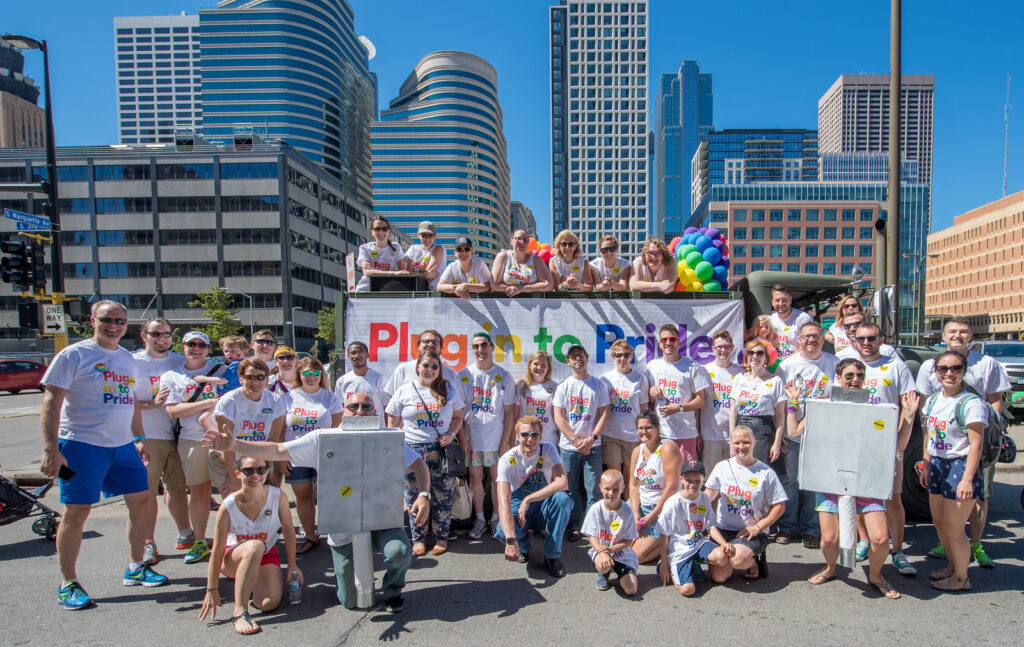
The identity was extended to the truck float that marchers followed during the parade, and I couldn’t be prouder of how it all came together. We marched in solidarity with our LGBTQIA friends and as a commitment to showing up and building a diverse and inclusive tech community.
The Takeaway
When you have to work quickly, you have to make quick decisions. Nevertheless, the final product is only as good as the amount of work you put into it. Be proud of your work and take ownership of getting it done. I went through tons of sketches, hit plenty of brick walls and had plenty of perfectly fine concepts get scrapped in the name of making the best work I could. Keep your work, show your process and always be open to iteration and feedback.
Have any questions? Reach out to me, I’d be happy to chat! Hit me up at kyle@softwareforgood.com.