Design is an exercise in empathy. As creative problem solvers, we’re challenged to find ways to mindfully align a client’s goals with the needs of their users. In the office and in life, I strive to put myself in the shoes of others to gain their insights. Overlooking seemingly minor considerations – color, contrast, type size, messaging – may create a fantastic experience for 99% of users, but only at the risk of alienating groups who already feel underserved by the technology they use.
Why should we care about pleasing everyone if our work is already good enough for the majority?
Cutting corners at the expensive of inclusivity only serves to perpetuate negative attitudes, stereotypes and social structures that are already deeply entrenched in the way we interact with technology and one another.
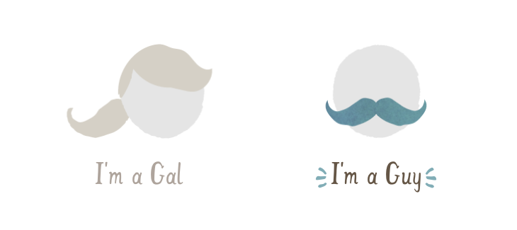
I recently signed up for Caribou Coffee’s Perks program through their mobile app. For the most part, I encountered a standard, branded sign-up experience, replete with delightful illustrations and icons. I filled out a form with my name, address, and birthday in the usual text fields, but something stood out to me when it came to asking for my gender:

Innocuous, right? Either you’re a gal with a pony tail or a bald guy with a mustache. And the illustrations are even race-neutral! Who could possibly feel alienated by this?
The icons clearly imply white, cisgendered (those who self-identify with the biological sex assigned to them at birth) men and women. The icons also reinforce manufactured assumptions of gender in our society: how ‘men’ should look and how ‘women’ should look. And what’s wrong with that? I’m a cisgendered white guy who clearly has the means to own a smart phone and has the time to download an app to get a dollar off a coffee every couple weeks. I may be their target demographic, but what about Minnesotans who identify as lesbian, gay, bisexual, transgender, queer, intersex or asexual (LGBTQIA)?
A 2012 Gallup Poll estimated that at least 118,000 Minnesotans identify as LGBT, and a frequently cited report from the Williams Institute estimates that at least 700,000 individuals in the United States identify as transgender. Statistics on their own provide a compelling case for inclusive UX design, but it’s important to note that identity statistics, as a whole, vastly underrepresent the size of the LGBTQIA community. Actual numbers are thought to be much higher, due to the stigma and danger associated with publicly identifying as a non-binary or transgender individual in this country. In 2013, 72% of hate violence homicide victims were transgender women.
But what do these cute icons have to do with the safety of LGBTQIA individuals? They’re just pictures. Caribou’s creative team probably just wanted to craft a delightful experience. Something simple. They wanted to streamline the gender selection process and make it something a little more ‘creative’ than a simple drop-down. I get it. But we must reflect on how small choices—in our software and our personal lives—can have a profound impact on the lives of others.
Our CEO, Casey Helbling, pondered these ideas in his Theme of the Week, “Continued Thoughts on Privilege.” He wrote, “Software shouldn’t be built only for people who are running downhill with the wind at their backs,” and I couldn’t agree more. By intentionally excluding marginalized individuals from the gender conversation and giving no option for them to opt-out of providing an answer that fits exclusively within the female/male gender binary, Caribou is effectively telling a subsection of their users them that their life experience is invalid. Or, worse yet, binary gender options put non-binary and transgender individuals in a position where they may feel like they have to give more information than they’re comfortable providing. I’m certain that this was never the intention of the organization, but as an empathetic designer, I put myself into the shoes of a user and find a cold shoulder where I should be finding a warm cup of coffee.
Does anyone care?
It turns out that designing for gender inclusivity is a hot topic among more progressive UX/UI designers, and I was delighted to find a lot of suggestions for designing more empathetic user experiences that cater to the broader gender spectrum. Just about every UX/UI expert agrees on one rule of thumb: don’t ask for gender unless you need to. Find ways around it. I even find the idea of gendered marketing campaigns to be an increasingly lazy way to connect with customers. If Target can start from the ground-up by removing gendered signage from their toy aisles, we, as designers, can find ways to communicate a client’s needs while still being inclusive of our LGBTQIA friends.
Jessica Ivins, a UX Designer and educator at Center Centre in Chattanooga, gave a talk at Code & Creativity on the topic of designing for gendered audiences. It’s terrific and definitely worth the 20 minutes of your time, but the big takeaway is the set of questions she asked herself when deciding how to best capture gender information for an email marketing campaign. Let’s apply them to Caribou’s app:
Is this a context where customers want to feel either masculine or feminine?
This is arguable. Above, I mentioned that we should challenge ourselves to find better ways to serve marketing materials to individuals, but that’s my personal perspective. Either way, an individual’s coffee beverage of choice is not at all influenced by their masculinity or femininity. In fact, I challenge all businesses and their products to find ways to market themselves without resorting to our manufactured ideas of masculinity or femininity.
Will our site refer to customers in the third person?
After I picked my gender, I’m either referred to by name or not at all. There’s no need for pronouns in this case.
If someone is transgender, genderqueer etc., does that matter in the context of this product?
The experience of using the Caribou app is the exact same for all users. I’m not served any special content based on my gender, so I’m curious why the information is needed, aside from the need of the organization to capture demographic info.
Do our customers have to show legal identification documentation to register for an account?
It’s a coffee rewards program, not the DMV.
Ok, maybe Caribou shouldn’t ask for gender information, but what if I need to design for a gendered interface or experience?
Certainly there are many apps that may require gender information. Medical device applications may need to consider biological sex. Social networking or other communication platforms with personalization features may want to know preferred pronouns or gender preference so they can craft a delightful experience for users. Luckily, there are better ways than just posing the user a question with a binary response.
Facebook has 56 options for capturing user gender. By allowing users to pick from a robust array of options, they sacrifice interface cleanliness at the benefit of user inclusivity. It’s not as pretty as two icons, but it’s beautiful from a user empathy standpoint.
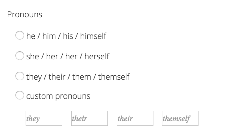
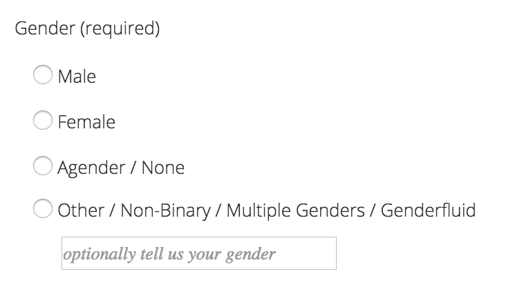
UX Designer Kylie Jack also put together a variety of options for capturing gender data:
Text Input Field

The text input field is useful for gathering custom gender information and gives the power of choice to the user, but only at the expense of post-processing jokes and outliers on the back end.
Radio Buttons for Pronouns with Text Input

This is a more visual way of letting users choose their pronouns, which helps create a more inclusive experience in apps with personalization features.
Gender Binary Options with Text Input

The custom field with binary option is less ideal, since it strips some of the power from the user and may lead transgender/non-binary individuals to feel as if they’re being ‘outed.’ Some individuals have no gender. Others identify across the spectrum. The decision to disclose gender is deeply personal and should be given to the individual themselves.
The Takeaway
In our work and lives, we’re surrounded by small decisions that may feel inconsequential to us depending on the privileges we carry or the identities we embody. It’s easy to take the easiest or prettiest way out of a complex issue, even at the expense of our most vulnerable and marginalized users. By continuing to turn a blind eye to the idea of holistic user empathy, we are contributing to a culture where those who don’t fit into the neat, binary buckets of gender and sexuality are cast further into corners while the normalization of cisgender privilege is furthered. Unless it’s absolutely necessary, let’s stop asking individuals to disclose their gender — especially if it has no effect on the experience of using the product.
We have a responsibility as designers, makers, marketers, and human beings, to cultivate environments that positively benefit and celebrate the lives of others instead of harming them, even in the smallest way. At Software for Good, our mission is to develop web and mobile applications for organizations working toward positive environmental and social change. Through user empathy and inclusivity, we’re always working toward that goal. How about you?

